
Wisebook - e-book case study
An engaging e-book app that has built-in dictionary feature with minimal interaction search action to help readers stick to reading.
My Role
Product Design
Timeline
Sep 2022
Tools Used
Figma, Adobe Photoshop
Overview
Problem Statement
Reading is fun… but other than just entertaining reading strengthens our brain activity, boosts communication skills and makes us intellectually strong along with the goal to obtain meaning. The reading process can also get difficult for some people when they face unrecognized words consecutively and don’t understand what they are reading. About 70-80 per cent of people have trouble with accurate and fluent word recognition, in most cases, this leads the reader to lose interest in reading.
Project Goal
-
Create a built-in dictionary feature with streamlined sync between the dictionary and reading. The process should consist of the least amount of interaction for the reader to reduce the hassle of word search.
-
Improve user experience by conducting a survey and collecting data on a reader’s basic needs and demands while reading books on an e-book app.
Initial Thinking
Target Users
-
E-book readers
-
Readers who have issue understanding words.
Research method
-
Online survey (google forms)
-
Secondary research.
-
Competitor Analysis.
User Research
Research Process
I started the process with topic and application research to gain basic knowledge related to reading experience on an e-book app and analyse the strong and weak points of existing applications. Furthermore, to understand the user’s pain points I conducted a google survey.
Research Goals
-
Analyse existing e-book applications, and what are the features they provide.
-
Identify the basic features/functions a reader needs in a book reading app.
-
Survey target user to identify their opinion and feedback on a dictionary feature.
Survey
I started with asking the readers about how much they use an e-book application to read books and their experience.
Question: What are the features in an e-book app you think are necessary for you?
-
More than 70 per cent of readers prefer to have ‘brightness and background colour adjustment’ option most.

In later questions, I introduced my idea of a built-in dictionary feature to get feedback of my target user.
Question: How important do you think the built-in dictionary feature is for you?

-
Over 70% of readers strongly believe the 'dictionary feature' is important to have in their e-book application. And, remaining find it a helpful feature.
-
None (0%) thinks that they don't need the help of built-in dictionary feature.
Personas

Journey map
After doing the research and making user personas based on that, I created a user journey map to lay out the touchpoints and how to take them to the main goal. This will tell how the user will interact with the app, what their experience will be like and what are areas of improvement.

Ideation
Information Architecture
I made a site map to organise the infrastructure, features and hierarchy of the flow of information within the app. This will determine how the user will navigate through the application functions and reach their goals.

User flows

Design
Sketchs & Wireframes

Style Guide
I have used a very neutral colour palette to keep it simple and nice for an app that is going to be used for reading purposes.
To make it easy to read and eye-friendly, I have used a combination of fonts ‘Source Sans Pro’ and ‘Roboto’ for the app interface. And, ‘Lora’ as the default font for reading.

High-fidelity Prototyping
Design Solution
01 Main Page
The home page shows a Personalized book recommendation list of users’ selected genres from the onboarding process. For an advanced search, books are categorized into different ‘genres’ and ‘authors.’ Scrolling down, users can access ‘trending’ or ‘recently released’ books to read.
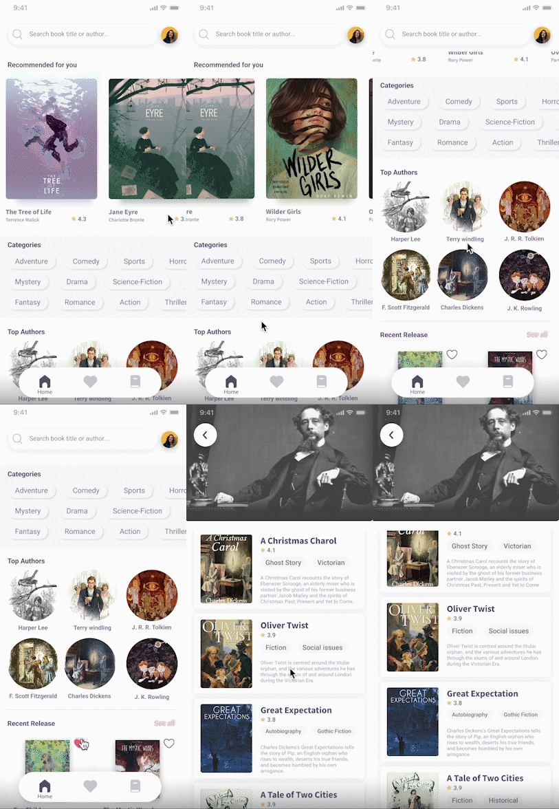
Home Page
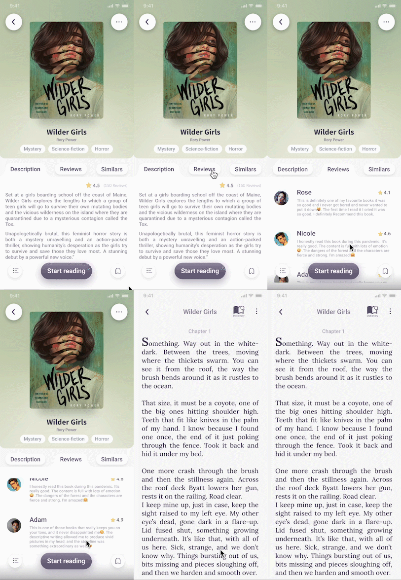
02 Cover Page
Book cover page displays basic information such as the title, Author’s name, rating and book genre along with a large preview of the book’s cover. It intuitively shows access to the book’s description (synopsis), reviews and similar books.
User can also view content to analyze the book before reading.


03 E-book
The reading page has subtle colour combinations for eye comfort.
There are two ways of using the dictionary while reading, first is the dictionary option on top right corner of the page, and long pressing on a word will open two options ‘search’ and ‘bookmark’, clicking on ‘search’ will make a dictionary box appear with the meaning on the screen.

Using dictionary


Settings and page alignment.


On the dictionary page user can look up the meaning of a word, which will include definition, usage, synonyms and translation.
04 Dictionary

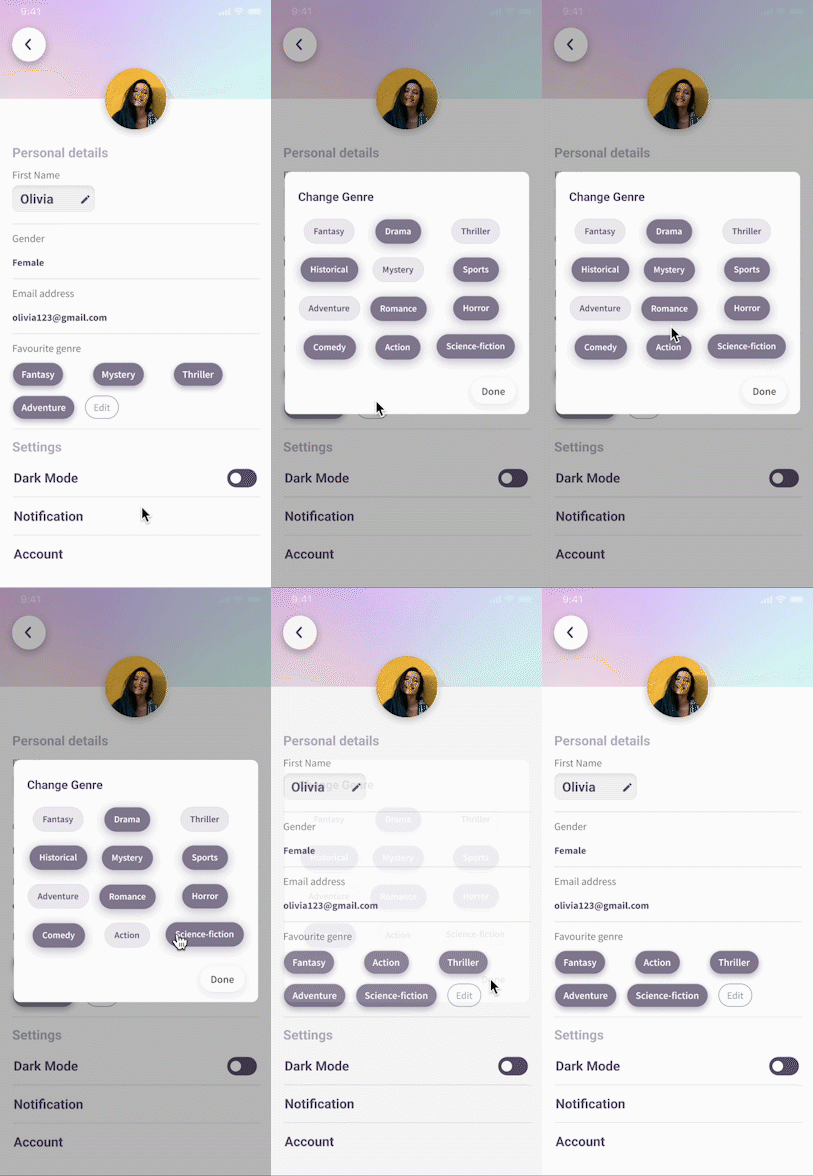
User’s information containing their name, gender, email ID along with account settings. From profile, user can view their selected genres and change them accordingly.
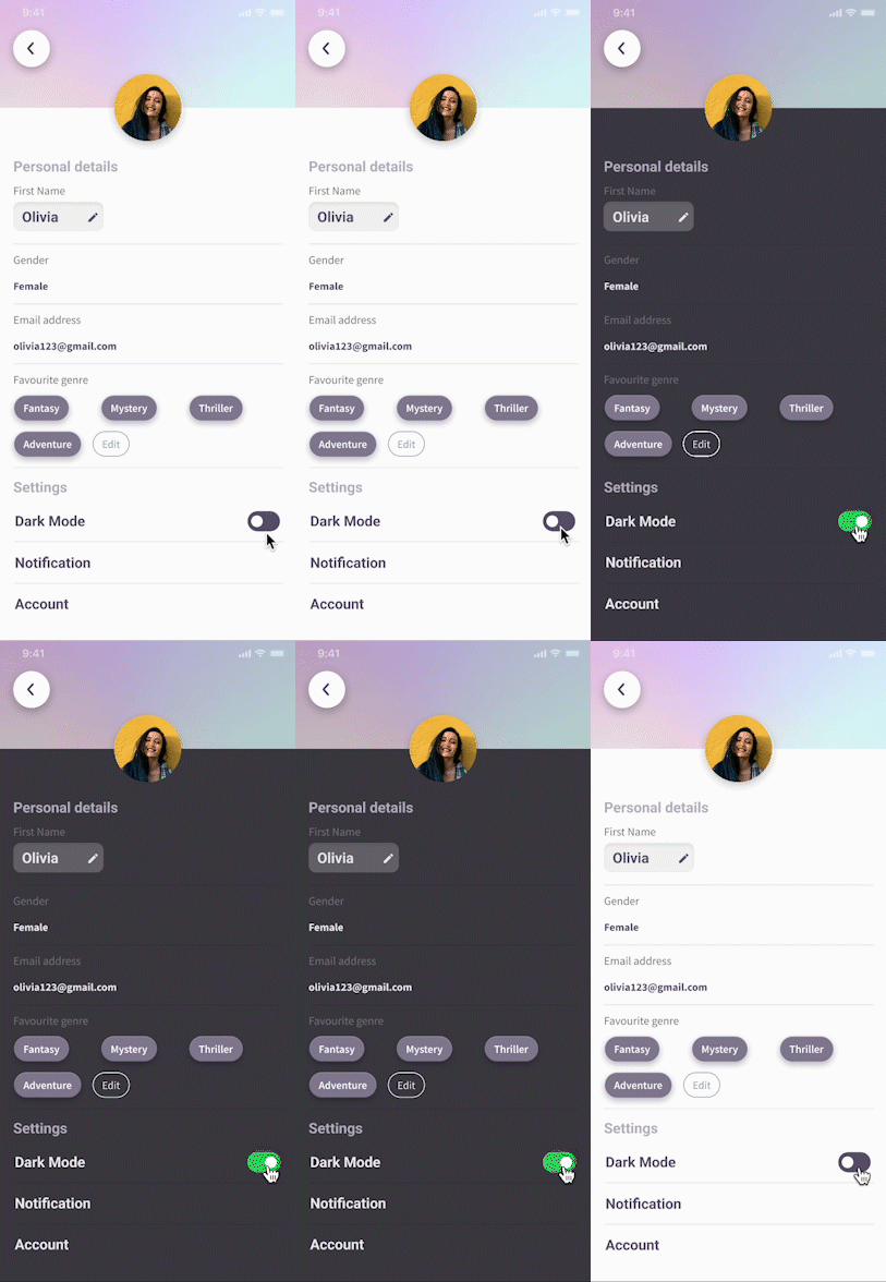
05 Profile Page
Dark Mode
06 Personal Collection


Click to go to the Figma file -
Reflections
Takeaways
This project has focused on user research process and identified needs. I learned the significance of asking correct questions to the users while surveying, this helped gather relevant information from the users.
During the ideation process, I struggled with how to scale down the ‘using dictionary’ process as much as possible for the user while reading in E-book. Also, I realised that it’s really important to layout the elements in such a way that users to know how to use the dictionary intuitively.
Designing an app that is simple as well as provides all the relevant features for reading purpose was quite challenging yet interesting. I wrote down the list of features I wanted to add to the app and selected only the significant ones based on the user’s needs.
I realised that the role of a UX designer is not only to design a good idea but also to develop everyday experience of the people with the design.